
Thursday, 30 September 2010
Wednesday, 22 September 2010
Tuesday, 21 September 2010
Lyrics
(0:00) Instrumental Intro (1:01) (61 seconds)
(1:01) Nightmare! (1:05) (4 seconds)
(1:05) (Now your nightmare comes to life) (1:10) (5 seconds)
(1:10) Dragged you down below down to the devil’s show, To be his guest forever, Peace of mind is less than never (1:18) (8 seconds)
(1:18) Hate to twist your mind, but God ain’t on your side
An old acquaintance severed,
Render of your last endeavor (1:25) (7 seconds)
(1:25) Ashes burning, you can smell it in the air,
Cause men like you have such an easy soul to steal.
So stand in line while banging numbers in your head,
You’re now a slave until the end of time
And nothing stops the madness turning,
haunting, yearning, pull the trigger! (1:42) (17 seconds)
(1:42)You should have known
The price of evil,
And it hurts to know that you belong here, yeah
Ooooh, it’s your fuckin’ nightmare
(2:02) (20 seconds)
(2:02) While your nightmare comes to life (2:08) (6 seconds)
(2:08) Can’t wake up in sweat, cause it ain’t over yet,
Still dancing with your demons,
Victim of your own creation beyond the will to fight,
Where all that’s wrong is right
where hate don’t need a reason
Love is self-assassination (2:22) (14 seconds)
(2:22) You’ve been lied to just to rape you of your sight,
And now they have the nerve to tell you how to feel.
So sedated as they medicate your brain
And while ya slowly go insane the tell you
Give in with your best intentions
Help ya with your complications (2:39) (17 seconds)
(2:39) You should have known the price of evil
And it hurts to know that you belong here, yeah
No one to call, everybody to fear
Your tragic fate is looking so clear, yeah.
Ooooo it’s your fuckin’ nightmare ha ha ha ha!! (3:16) (37 seconds)
(3:16) Instrumental (4:02) (46 seconds)
(4:02) (ha-ha-ha-ha-ha-ha) (4:04)
(2 seconds)
(4:09) Fight, fight, not to fail, fail Not to fall, fall anekatips Or you’ll end up like the others. (4:16) (7 seconds)
(4:16) Die, die, die again, die
Drenched in sin, sin
With no respect for another (4:18) (2 seconds)
(4:18) Oh! (4:19) (1 second)
(4:35) Death, You!
Feel the fire, fire
Feel the hate, hate
Your pain is what we desire.
Lost, lost, hit the wall, wall
Watch you crawl, crawl
Such a replaceable liar. (4:49) (14 seconds)
(4:49) And I know you hear their voices (calling from above), And I know they may seem real (these signals of love), But a life’s made up of choices (some without appeal), (5:12) (23 seconds)
(5:13) They took for granted your soul
And it’s ours now to steal (5:20)
(7 seconds)
(5:22) As your nightmare comes to life (5:26) (4 seconds)
(5:26) You should have known the price of evil
And it hurts to know that you belong here, yeah
No one to call, everybody to fear
Your tragic fate is looking so clear, yeah.
Ooooo it’s your fuckin’ nightmare ha ha ha ha!! (6:03) (37 seconds)
(6:03) Ending (6:18) (15 seconds)
question/answers
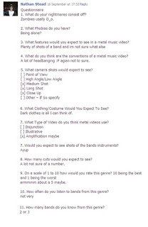
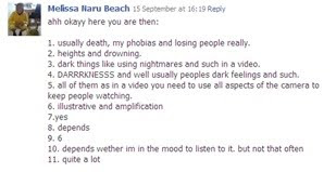
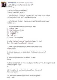
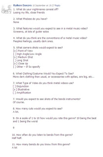
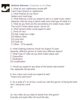
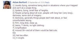
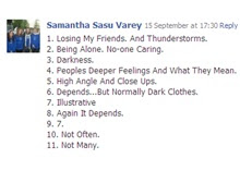 1. What do your nightmares consist off?
2. What Phobias do you have?
3. What features would you expect to see in a metal music video?
4. What do you think are the conventions of a metal music video?
5. What camera shots would expect to see?
[ ] Point of View
[ ] High Angle/Low Angle
[ ] Medium Shot
[ ] Long Shot
[ ] Close Up
[ ] Other – If So specify
6. What Clothing/Costume Would You Expect To See?
7. What Type of Video do you think metal videos use?
[ ] Disjunction
[ ] Illustrative
[ ] Amplification
7. Would you expect to see shots of the bands instruments?
8. How many cuts would you expect to see?
9. On a scale of 1 to 10 how would you rate this genre? 10 being the best and 1 being the worst
10. How often do you listen to bands from this genre?
11. How many bands do you know from this genre?
Monday, 20 September 2010
Thursday, 16 September 2010
Word Cloud - Video Ideas
K-ON! No, Thank You!
Avenged Sevenfold - A Little Piece Of Heaven
This official full version of this video cant be uploaded so this is an example of the video.
to watch the full video please follow this link.
http://www.youtube.com/watch?v=VurhzANQ_B0&feature=fvstAha - Take On Me
This video isn't of the same genre but it has a similar usage of real footage and animated footage.
Tuesday, 14 September 2010
Thursday, 9 September 2010
Album Advert
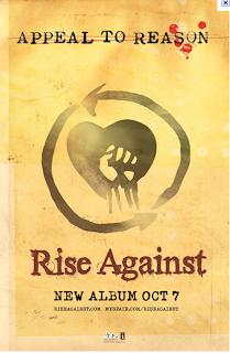
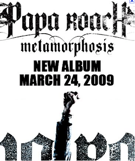
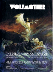
- Band Name
- Album Name
- Record Company Name
- Release Date
- Images of the album cover/ images that relate to the album
- Any other special releases of the album e.g. Deluxe Edition
- Band Logo
- Reviews
- Bonus Tracks
- Band Name
- Album Name
- Album Cover or related image/colour scheme

Monday, 6 September 2010
Album Analysis


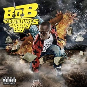
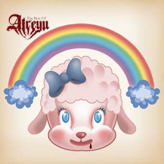
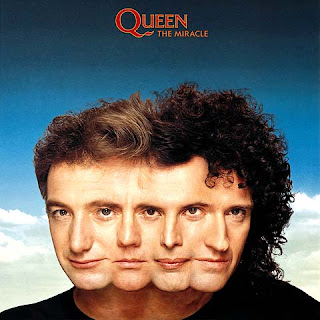
Typical Feature of an album cover
Artist name
Album name
Image of the artist/band logo
Parental advisory sticker if needed
Album Art
Usually a lot of colour
Most of these album have images of the band on them in one way or another. The avenged Sevenfold one uses drawing of the band. The Atreyu one uses album art on its cover which is typical of the this band. They all use the name of the artist on the album cover. The band is one way or another the focus of the albums. They all use quiet bright colours.
The album covers I have chosen can be categorised by genre because they are all from different genres. The album are distinct from each other at they represent there genre through specifically chosen elements, the albums also represent the type of fan which would follow these artist. Another way to catogerise them is by the number of album meaning how many albums where released before each album, the albums show specific elements showing this one of the albums is titles ‘the best of’ showing there are roughly 3 album released before it and one is a self name album meaning it uses the name of the artist as the album name, this shows that it is the first album released by the artist.
The purpose of these albums is to attract their audiences by using typically elements which represents there audience and appeal to there interests. They also try to attract new audiences by making the album stand out above the rest of the albums to entice people to listen to them. It could also be used to create a fan base when releasing album so they try to make them selves seem real and not distant them selves from listeners by trying to show there fame more than there personality.
Detailed Analysis
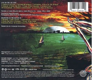
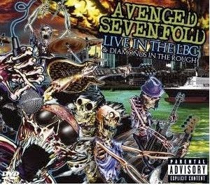
Front
The image on the front is a cartoon style of the band, this fits into the genre of the band who are a kind of rock/metal band who use there own style of music mixing with punk and metalcore genres. This represents the genre because it is quite a dark cover with the skeletons on the screen and dirty water although they use brighter colours, which are not often used in metal bands truly showing that they are a mixed genre band. It also reflects the band as the characters are made to represent the band by adapting the hairstyles and clothing styles of each member and adding their instruments.
The positioning of the band and the positioning of the background looks like the band is performing to a live audience this represents the nature of the album it is a live album so this gives the sense of it being live.
The bands name is in a large font at the top left hand corner and it is then followed by the title name directly beneath. It is in large text so it is clearly visable to the audience. The colour of the text is in a similair colour shceme to the album cover as it uses a similair green for the name of the band as is used in the background image.
The parental advisory badge in the corner shows the audience that there may be material that people may find offensive, this is common on albums of this genre.
The DVD badge shows that in side there is a live DVD of the band performing this album, the title also mentions that the band are performing live in the LBC so you would expect to see a DVD.
Along with the title saying that the and are performing live in the LBC it also mentions that you are getting “diamond in the rough” this shows the audience that they are getting two DVDs in the package.
The back of the album is similiar to the front of the album as the image of the mucky water from the front of the album is carried out on to the back. we also see the image of the singers cartton arm which also carries on from the front of the album so that when it is open is creates a full image.
The art of the drawing is the band signiture, this allows the audience to relate to album and know that it is an official album by the band.
the style of the album cover shows that the band are more of an underground grunge band and shows that they are not a mainstream band.
This album shows that the audience maybe be teenagers who may dress in dark colours and listen to grunge music. We see this in the way that the band are dressed and the colour scheme used in the art work.


