

Typical Conventions
- Band Name
- Album Name
- Record Company Name
- Release Date
- Images of the album cover/ images that relate to the album
- Any other special releases of the album e.g. Deluxe Edition
- Band Logo
- Reviews
- Bonus Tracks
Conventions They Have In Common
- Band Name
- Album Name
- Album Cover or related image/colour scheme
I would categorise them by genre and the fans that follow the bands.

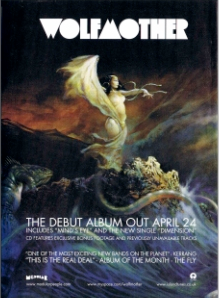
The image used in this poster is the same picture which is used as the album cover. The image takes up the entire poster as it is used as the background for the poster. This image is used to attract the audience because it is a very colourful image, but it is also used so that when the album is released its target audience will actually be able to found it in a store, because they have become so related to the album cover before its released. The text in the poster is white so that it can stand out from the background, so that the audience and clearly read the information. The name of the band is in large text so that people instantly know who the poster belongs too and to attract the target audience. The white of the text matches the colour scheme of the background image as when you think of wave and the see we often think of blue and white, white being the end of the waves. We also know that the album is self titled because of the large band name which is followed by no text showing us the artists name and album name. The image shows us that the artists bout me more underground than mainstream as it is not made to appeal to everyone. The image in the background has become a signature of the band.
No comments:
Post a Comment